
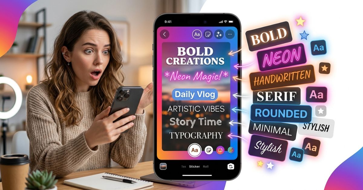
Quick Answer: Instagram Story fonts are built-in letter styles used to add words to photos and videos. You can change them in a few taps using the Instagram text tool by sliding through options at the bottom of the screen. While Instagram offers 15 built-in fonts, you can also use design apps like Canva or online text generators for more custom letter styles.
What Are Instagram Story Fonts?
Instagram Story fonts are the different letter designs built into the app to help you put text over photos and videos. They are shared with Reels and are found directly inside the Instagram text tool on the Story editing screen.
Fonts and text styles work together to change how your words look. A font changes the shape of the letters, while text styles add extra background colors or outlines. Picking the right font style helps catch a viewer’s eye and keeps people from skipping your post.
All Instagram Story Fonts Explained (Complete Font Guide)
Instagram gives you 15 built-in font options, including core choices like Classic, Modern, Neon, Typewriter, Strong, Signature, Editor, Poster, Bubble, Deco, Squeeze, Journal, Meme, Literature, and Instagram Sans, as well as seasonal styles. Each font creates a different mood and works best for specific types of posts.
| Font Style | Best For | Avoid When |
|---|---|---|
| Classic | Quick updates, simple captions, short notes | Loud sales posts or big announcements |
| Modern | Clean brand updates, fashion, simple quotes | Old-style photos or casual personal rants |
| Neon | Nightlife, fun party posts, big callouts | Long paragraphs of text or serious news |
| Typewriter | Cozy moments, journal entries, storytelling | Fast product sales or modern tech posts |
| Strong | Big sales, bold headlines, urgent news | Soft pretty photos or quiet personal moments |
| Signature | Personal notes, artist signatures, quick thoughts | Long informative posts that must be easy to read |
| Editor | Formal news, blog links, newspaper-style quotes | Fun, casual memes or high-energy posts |
| Poster | Short bold headlines, event dates, loud alerts | Long sentences or small detail text |
| Bubble | Playful moments, posts for kids, friendly chats | Professional business news or serious topics |
| Deco | Fancy events, art posts, classic design style | Main paragraph text or fast tutorials |
| Squeeze | Tight spaces, long headlines in small areas | Short single-word callouts |
Classic
- Appearance: Simple, clean, and plain smooth letters.
- Best Use Cases: Short captions and simple daily updates.
- Strengths: Very easy to read on any background.
- Weaknesses: Can look plain if used without colorful background blocks.
Modern
- Appearance: Tall, neat, smooth text.
- Best Use Cases: Fashion posts, clean aesthetic pictures, and modern brands.
- Strengths: Looks professional and sleek.
- Weaknesses: Hard to read if you type long sentences in all capital letters.
Neon
- Appearance: Glowing cursive writing that looks like a bright neon sign.
- Best Use Cases: Evening posts, party invites, and big callout words.
- Strengths: Instantly grabs your attention.
- Weaknesses: Can hurt the eyes if you write too much text.
Typewriter
- Appearance: Old-fashioned style that looks like text from an old typewriter machine.
- Best Use Cases: Storytelling, behind-the-scenes clips, and book quotes.
- Strengths: Feels cozy, personal, and real.
- Weaknesses: Takes up a lot of side-to-side space across the screen.
Strong
- Appearance: Thick, heavy bold letters made to catch attention.
- Best Use Cases: Flash sales, important alerts, and fast-paced videos.
- Strengths: Demands attention and pops off dark or light backgrounds.
- Weaknesses: Takes over gentle photos or soft pictures.
Signature
- Appearance: Fancy, flowing handwritten script.
- Best Use Cases: Adding your name, quick personal notes, or decorative touches.
- Strengths: Feels warm, human, and creative.
- Weaknesses: Very hard to read quickly when people swipe fast.
Editor
- Appearance: Classic style with small end strokes, like traditional newspaper print.
- Best Use Cases: Article shares, thoughtful quotes, and news updates.
- Strengths: Gives your posts instant trust and neatness.
- Weaknesses: Feels too stiff or serious for casual personal posts.
Poster
- Appearance: Blocky, retro 3D letters with a sharp shadow behind them.
- Best Use Cases: Big event announcements and fun titles.
- Strengths: Stands out clearly without needing extra text background blocks.
- Weaknesses: Looks messy if you use more than three or four words.
Bubble
- Appearance: Soft, rounded, fun letters that look puffed up.
- Best Use Cases: Playful personal posts, jokes, and fun questions.
- Strengths: Looks friendly and casual.
- Weaknesses: Looks unprofessional for serious business accounts or sales pitches.
Deco
- Appearance: Fancy art-style lines with shapes and angles.
- Best Use Cases: Pretty photos, event invites, and artistic design work.
- Strengths: Adds a stylish, high-end look right away.
- Weaknesses: Letters can blur together if the text size is too small.
Squeeze
- Appearance: Narrow, tight letters packed close together.
- Best Use Cases: Long titles that need to fit across one line.
- Strengths: Fits a lot of words into tight spaces.
- Weaknesses: Looks crowded if you do not leave space between lines.
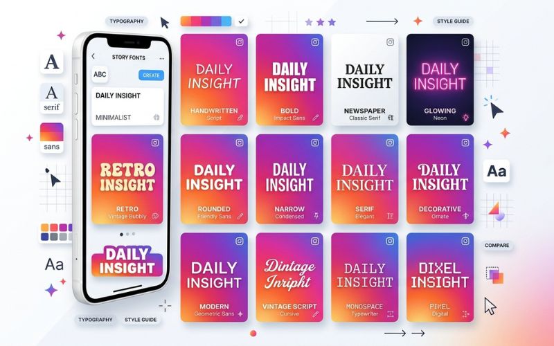
How to Change Fonts on Instagram Story
Changing your font takes only a few seconds while making your post:
- Open Story Camera: Swipe right from your main Instagram feed or tap your profile picture with the plus sign.
- Tap the Screen: Take a photo or video, then tap anywhere on the screen or use the text tool to type your message.
- Type Your Text: Use your keyboard to write out your message.
- Swipe Through Fonts: Scroll sideways through the font names listed right above your keyboard. Tap any font name to see how it looks on your photo.
- Change Size and Color: Drag the bar on the left side of the screen up or down to change text size. Tap the color circle at the top to pick a color.
- Publish Your Story: Tap Done in the top right corner, move your text where you want it, and tap Your Story to post it.
How to Get More Fonts (Built-in vs. Text Generators vs. Design Apps)
You can choose between built-in fonts, copy-paste text generators, or extra design apps based on what you need.
Start here: Do you need custom brand fonts?
  ├── Yes ──> Use Design Apps (Canva, Unfold, Adobe Express)
  └── No ──> Need decorative symbol text?
        ├── Yes ──> Use Online Text Generators
        └── No ──> Use Built-in Instagram Fonts
Built-in Instagram Fonts
Built-in fonts come ready to use inside the Instagram app. They load fast, work on all phones, and let you edit text smoothly inside the app. They are great for quick daily updates.
Online Text Generators
Text generators are free web tools that turn normal text into unique symbols. You type words on a website, copy the result, and paste it into your Instagram Story text box.
- Pros: Free, fast, and easy to use.
- Cons: Screen readers for visually impaired people cannot read these symbols, and older phones might show blank square boxes instead of letters.
Design Apps
You can make your Story graphic in outside app tools before uploading it to Instagram:
- Canva: Gives you saved brand kits and thousands of font choices.
- Unfold: Features neat templates and stylish magazine-like fonts for Stories.
- Phonto: Focuses purely on putting text onto photos easily.
- Adobe Express: Great for users who want high-quality custom lettering.
| Method | Easy to Use | Safe & Accessible | Brand-Friendly | Editable in App |
|---|---|---|---|---|
| Built-in Fonts | High | High | Medium | Yes |
| Text Generators | High | Low | Low | Yes |
| Design Apps | Medium | High | High | No (must export again) |
Best Instagram Story Fonts for Different Goals
Using the right font for your specific goal makes your posts work better.
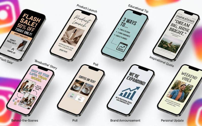
- Promotions & Sales: Use Strong or Poster to make sale percentages and discount codes pop out. For example, a local coffee shop sharing a weekend flash sale should use Poster to catch attention fast.
- Product Launches: Use Modern for clean, tall lines that give new items a sleek, high-quality feel.
- Educational Stories: Use Classic or Editor to keep long tips clean and easy to read.
- Quotes: Use Typewriter or Editor to give your text a real book feel.
- Behind the Scenes: Use Signature or Bubble for a warm, friendly touch. A photographer sharing raw work scenes will like Typewriter or Signature.
- Polls & Questions: Use Classic for the main question so viewers can answer right away.
- Brand Announcements: Use Editor or Modern to look official and trustworthy.
- Personal Updates: Use Typewriter or Classic for a direct and friendly message.
| Story Goal | Recommended Font | Why It Works |
|---|---|---|
| Promotions | Strong | Big, bold letters make people act fast during sales. |
| Product Launches | Modern | Sleek look gives a high-quality feel. |
| Educational Posts | Classic | Simple lines make long paragraphs easy to read. |
| Quotes | Typewriter | Feels cozy and real, like a real book. |
| Behind the Scenes | Signature | Handwritten style feels warm and relaxed. |
| Polls & Questions | Classic | Super clear text gets more answers. |
| Brand Announcements | Editor | Formal newspaper style looks official and serious. |
| Personal Updates | Typewriter | Feels like a direct text message to a friend. |
Instagram Story Text Tips That Make Reading Easier
Good text arrangement helps people read your message in a quick second before swiping away:
- Use Large and Small Text Sizes: Use a large, bold font for the main headline and a smaller font for smaller details to guide the reader’s eyes.
- Make Text Pop Against the Background: Use dark text on light backgrounds or light text on dark pictures so words stand out clearly.
- Set Alignment and Spacing: Center short quotes, line up paragraphs to the left side, and keep text away from the edges of the screen.
- Color Choices: Pick two or three colors that match items in your picture using the color picker tool.
- Background Blocks and Shadows: Add background color bars, shadows, or outlines to help letters stand out on busy photos.
- Watch the Screen Edges: Keep your words away from the top profile bar and the bottom message box so buttons do not cover your words.
Text Animation Tips for Instagram Stories
Adding movement to words catches the eye of viewers who watch Stories with their sound turned off.
Built-in Text Animations
Tap the moving text icon at the top of the screen to animate any built-in font:
- Typewriter: Types words out letter by letter like a keyboard.
- Fade: Smoothly brings words onto the screen.
- Bounce: Pops text into place with fun movement.
- Slide: Sweeps full sentences across your photo.
- Other Options: You can also pick from styles like Pop, Jump, Sparkle, Neon, Shimmer, and Pixel.
When Moving Text Helps vs. Distracts
Animate your main headline to hook viewers right away. Keep full paragraphs still so people can read them without getting distracted.
Tips for Making Fonts Easy for Everyone to Read
Making your posts easy to read ensures everyone can enjoy your content:
- Screen Readers: Screen readers read text out loud for visually impaired users. Built-in Instagram text works great with screen readers, but text from generators often sounds like broken gibberish.
- Size and Brightness Contrast: Keep font sizes large and keep a strong contrast between your text color and background picture. Avoid writing full paragraphs in all capital letters.
- Avoid Fancy Cursive for Important Details: Never use fancy handwriting fonts for key details like dates, times, or sale rules.
Why Your Instagram Story Fonts Are Missing or Different
Sometimes your app looks different from a friend’s app. Here is why fonts might be missing:
- Slow Updates for Different Regions: Instagram tests new font features in some regions before giving them to everyone.
- Old App Version: Forgetting to update your app keeps new font options locked.
- Different Phones: Android phones and iPhones show fonts differently.
- App Data Glitches: Saved app data can freeze updates and hide new tools.
- Beta Test Groups: Users signed up for app testing get new layout updates early.
Quick Fixes
- Open your phone app store and update Instagram to the newest version.
- Close the app completely and clear your app cache in phone settings.
- Restart your phone to clear quick memory bugs.
- Log out of your Instagram account and log back in.
Common Mistakes to Avoid When Using Instagram Story Fonts
Avoid these design mistakes to keep your Stories looking great:
- Poor Color Contrast: White text over bright background pictures makes words invisible.
- Long Paragraphs in Fancy Fonts: Writing long text blocks in script or glowing neon fonts hurts the reader’s eyes.
- Mismatching Your Brand Look: Using playful fonts when your business is serious can confuse your followers.
- Tiny Text: Making text too small forces viewers to squint or zoom in.
Instagram Story Font Steps for Creators and Brands
Having a simple plan saves time and keeps your account looking neat.
Creator Plan
Pick one main font for daily updates and pair it with a second font for link callouts. Save your favorite color set in your phone notes app for quick use.
Small Business Plan
Use formal serif fonts for announcements and clean plain fonts for price lists. Save your brand color in the color picker tool for every post.
Store Account Plan
Create groups of sale post templates in design apps using bold fonts. Keep built-in fonts ready for quick, live updates from your shop floor.
Quick Instagram Story Font Checklist
Check off these points right before you post:
- [ ] One or two fonts only
- [ ] Clear text color against the background
- [ ] Easy-to-read size on phone screens
- [ ] Matching brand style
- [ ] Minimal moving text
- [ ] Text kept away from screen buttons and edges
Final Thoughts
Learning to use Instagram Story fonts helps your posts look great and catches attention right away. By picking clear font choices, keeping strong background contrast, and matching your text style to your goal, your posts will stand out. Start with Instagram’s built-in options, make your text easy for everyone to read, and keep a consistent style!
Frequently Asked Questions
What fonts are available in Instagram Stories?
Instagram gives you 15 main built-in fonts, including options like Classic, Modern, Neon, Typewriter, Strong, Signature, Editor, Poster, Bubble, Deco, Squeeze, Journal, Meme, Literature, and Instagram Sans.
How do I change the font in an Instagram Story?
Open the Story camera, tap the screen to open the text tool, type your message, and swipe through the font names listed above your keyboard.
Can I upload my own font file to Instagram?
No, you cannot upload custom font files directly into the Instagram app. You can make posts in outside design apps using custom fonts and upload the picture.
How do I get more Instagram Story fonts?
You can get extra fonts by copying text from online font generators or by designing posts in outside mobile apps like Canva.
Why don’t I have the same fonts as my friend?
Instagram rolls out new features slowly across different countries and phone models. Update your app to the newest version to check for new features.
Are online text generators safe to use?
Yes, online text generators are safe, but screen readers cannot read them properly, and older phones may show them as blank square boxes.
Do custom fonts change how many people see my Story?
Using custom fonts does not change your post reach directly. But hard-to-read text makes viewers swipe away quickly, which lowers your total engagement.
Which Instagram Story font is easiest to read?
Classic and Modern are the easiest fonts to read because their clean lines look sharp on screens of any size.
Can I use Canva fonts in Instagram Stories?
Yes. You can design your post graphic in Canva using any font, save the image to your phone, and upload it straight to your Story.
Which font is best for business accounts?
Editor paired with Classic works best for business profiles to make your account look professional and trustworthy.
Why do custom fonts show up as square boxes on some phones?
Older mobile phones cannot load special symbol characters and replace them with blank square boxes.
Can I animate every Story font?
Yes, every built-in Instagram font can be animated by tapping the moving text button at the top of your text screen.
You May Also Like:
How to Make Custom Instagram Story Templates
Instagram Story Sizes and Image Rules Simple Guide
Disclaimer:
This article is for informational and educational purposes only. Features and fonts on Instagram may change over time. Some images in this article may be AI-generated for illustration only. All trademarks, logos, brand names, and copyrights belong to their respective owners. We do not claim ownership of third-party content.

Eleanor Karen is an administrator at PVStory.co.uk who writes about digital tools, social media trends, and online resources. She shares helpful insights on Instagram Story Viewer tools and other web-based solutions, helping readers stay informed and make the most of their online experience.