
Instagram Stories help you connect with your followers every day. Over 500 million accounts use Stories to share photos and videos. Creating aesthetic Instagram Stories with clean, consistent designs helps your posts stand out and encourages more people to keep watching instead of skipping them.
In this guide, you’ll learn how to make aesthetic Instagram Stories by choosing the right styles, using phone apps, creating reusable templates, and tracking Story performance to improve engagement.
At a Glance: Style & Tool Guide
| Style Name | Best Used For | Recommended App | Skill Level |
| Minimalist (Very Simple) | Quick thoughts and quotes | Canva | Very Easy |
| Neutral Earth Tone (Natural Colors) | Coffee pictures and daily life updates | Unfold | Easy |
| Film Frame & Vintage (Old-School Look) | Vacation trips and retro photos | Tezza / VSCO | Medium |
| Collage Style (Photo Grouping) | Photo recaps and mood boards | PhotoGrid | Medium |
| Dark Luxury (Fancy Dark Look) | Nightlife and expensive products | Adobe Express | Medium |
| Soft Pastel (Light Colors) | Skincare and morning routines | VistaCreate | Easy |
| Brand / Business | Product sales and reviews | Figma / Canva | Medium |
Quick Summary Box
- What is a pretty (aesthetic) story? It is a story designed with careful choices for colors, fonts, and photo spacing, instead of random messy items.
- Best Story Size: 1080 × 1920 pixels (9:16 screen shape).
- Top Beginner Apps: Canva, Unfold, Adobe Express.
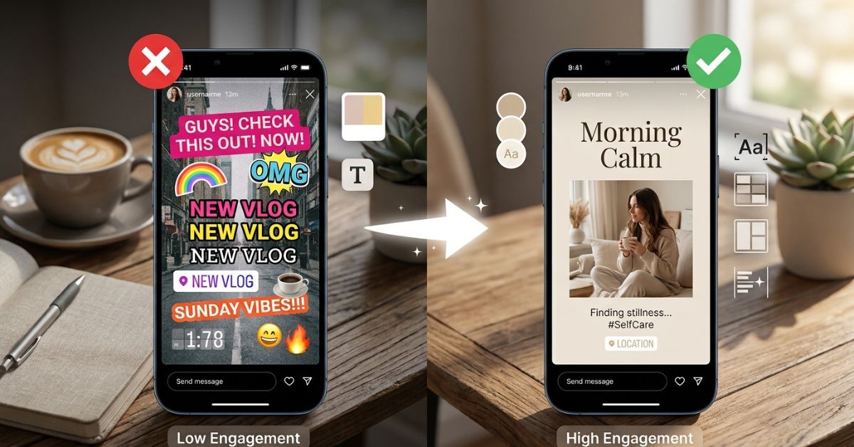
Visual Example: Before vs After
| Messy Story (Before) | Pretty Story (After) |
| Text written in 4 different colors | 1 text color that matches the photo |
| Stickers covering the main picture | Small stickers placed in empty corners |
| Words cut off by the phone screen | All words kept safely inside the screen area |
| Bright background that hurts the eyes | Soft, simple background color |
What Makes an Instagram Story Look “Pretty”?
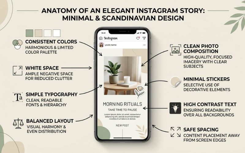
A pretty Instagram Story is made with careful planning. It uses matching colors, easy-to-read words, and clean photo layouts. This style makes your profile look organized, neat, and trustworthy.
When your story design is simple, your message is easier to read. Viewers do not have to struggle to see your pictures or read your words.
Today, top creators prefer curated authenticity. This means sharing real, everyday moments without making them look fake or overly edited.
The Best Pretty Instagram Story Styles Today
Here are the top popular styles you can use for your account:
Minimalist (Very Simple)
- Description: Plain layouts with light backgrounds and very few graphics.
- Best Uses: Daily thoughts, quick updates, and short quotes.
- Good Colors: Pure white, pale gray, and off-white.
- Good Fonts: Simple, clean fonts like Helvetica or Modern.
- Difficulty: Very Easy.
Neutral Earth Tone (Natural Colors)
- Description: Warm, natural design using cozy shades like dirt, wood, and leaves.
- Best Uses: Coffee pictures, outdoor shots, and daily life updates.
- Good Colors: Warm cream, tan, forest green, and rich brown.
- Good Fonts: Classic book-style fonts or typewriter styles.
- Difficulty: Easy.
Film Frame & Vintage (Old-School)
- Description: An old-fashioned style that adds polaroid borders, film roll edges, or soft graininess.
- Best Uses: Vacation trips, old party memories, and event photos.
- Good Colors: Grainy black, soft cream, and faded yellow.
- Good Fonts: Typewriter or vintage slanted text.
- Difficulty: Medium.
Collage Style (Photo Grouping)
- Description: Places several overlapping pictures, paper edges, and tape graphics on one screen.
- Best Uses: Weekend recap posts, photo collections, and mood boards.
- Good Colors: Brown paper bag color, torn white paper, and muted gray.
- Good Fonts: Clean handwriting or simple bold text.
- Difficulty: Medium.
Dark Luxury (Fancy Dark Look)
- Description: A high-contrast style using dark backgrounds paired with shiny details.
- Best Uses: Nightlife events, high-end products, and fashion photos.
- Good Colors: Pure black, dark charcoal, shiny gold, and bronze.
- Good Fonts: Thin, elegant book-style fonts.
- Difficulty: Medium.
Y2K & Cyber (Bright 2000s Look)
- Description: A retro style inspired by early 2000s technology and bright glowing shapes.
- Best Uses: Music choices, pop culture updates, and youth events.
- Good Colors: Bright neon pink, electric blue, and silver.
- Good Fonts: Blocky pixel fonts or digital text.
- Difficulty: Advanced.
Soft Pastel (Light & Dreamy)
- Description: Dreamy layouts using soft, powdery shades.
- Best Uses: Skincare reviews, morning sunlight, and health reminders.
- Good Colors: Soft blush pink, light lavender, and mint green.
- Good Fonts: Rounded lettering or simple script.
- Difficulty: Easy.
Travel Journal
- Description: Looks like a real paper notebook with maps, stamps, and written notes.
- Best Uses: Flight updates, city travel guides, and holiday recaps.
- Good Colors: Sky blue, sand beige, and passport red.
- Good Fonts: Casual handwriting mixed with simple printed text.
- Difficulty: Medium.
Wellness & Lifestyle (Health & Daily Routine)
- Description: A calm, clean style that focuses on quiet daily habits.
- Best Uses: Workout tracking, healthy meals, and daily routines.
- Good Colors: Calm sage green, oat milk beige, and soft white.
- Good Fonts: Light book-style text or simple modern text.
- Difficulty: Easy.
Brand / Business Stories
- Best Uses: Sales announcements, website links, customer reviews, and new products.
- Good Colors: Your official business colors.
- Good Fonts: Your official company font.
- Difficulty: Medium.
How to Make Pretty Instagram Stories Step-by-Step
Follow these simple steps to build your story post:
- Choose One Visual Style: Pick one style from the list above that matches your photo. Do not mix old film frames with bright neon stickers in the same post series.
- Select Your Colors: Pick two or three colors for your text and graphics. Use the color dropper tool to pick shades directly out of your background photo.
- Choose 1–2 Fonts: Use a maximum of two font styles on any screen. Match one bold font for your main title with a simple font for extra details.
- Use Clean Backgrounds: Place busy, detailed photos over a plain, solid background color. This helps your words stand out clearly.
- Arrange Photos Carefully: Line up your images neatly. Keep borders straight and leave equal space between pictures.
- Leave White Space: White space is the empty area around your text and photos. Leaving open spaces gives your post room to breathe.
- Add Stickers Sparingly: Stickers are fun to interact with, but too many will make your image look messy. Limit yourself to one main sticker per post.
- Save at High Quality: Save your finished picture at full quality before uploading. High quality keeps your photos looking sharp.
Story Sizes, Safe Zones, and Design Rules
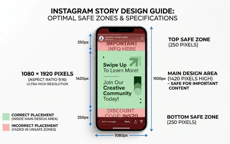
An Instagram Story needs to be 1080 × 1920 pixels with a 9:16 aspect ratio (tall phone screen shape). Staying inside safe zones keeps your text and pictures from being covered up by Instagram’s buttons.
| Setup Item | Standard Rule | Key Detail |
| Dimensions | 1080 × 1920 pixels | Standard phone screen size |
| Aspect Ratio | 9:16 | Full-screen vertical shape |
| File Types | JPG, PNG, MP4 | PNG keeps text looking clear |
| Video Length | Up to 60 seconds | Longer videos split into smaller clips |
| Safe Zone | Top and bottom 250 pixels | Keep text away from screen edges |
Understanding Safe Zones
Safe zones are the empty areas at the top and bottom of your screen. Instagram puts your profile name at the top edge and the reply bar at the bottom edge.
Keep all words, logos, and main picture details inside the middle 1080 × 1420 pixel box so buttons do not cover your words.
+-----------------------------------+
|  [ TOP SAFE ZONE - 250 PIXELS ]   |  <-- Profile Name & Time Bar
+-----------------------------------+
|                                   |
|         MAIN DESIGN AREA          |  <-- Place text & photos here
|         1080 x 1420 PIXELS        |
|                                   |
+-----------------------------------+
| [ BOTTOM SAFE ZONE - 250 PIXELS ] |  <-- Reply Box & Buttons
+-----------------------------------+
Image Quality and Easy-to-Read Tips
- Turn on High-Quality Uploads: Open Instagram, go to your Settings menu, find Media Quality or Data Usage, and turn on Upload at highest quality.
- Use Strong Color Contrast: Place dark text on light backgrounds, or white text on dark backgrounds.
- Save Photos in Simple Formats: If you use an iPhone, saving photos as JPG or PNG files before editing helps stop picture glitches on other phones.
- Check Video Brightness: Videos recorded with special bright video modes (HDR) can sometimes show up with strange brightness on different screens.
Best Apps for Making Pretty Instagram Stories
Mobile apps offer quick pre-made designs you can edit right on your phone.
| App Name | Best Used For | Free Option | Paid Option | Easy for Beginners? |
| Canva | All-in-one picture design | Yes | $12.99–$15/month | Very Easy |
| Unfold | Clean frames and text | Yes | $9.99–$12.99/month | Very Easy |
| Adobe Express | Fast text layouts and graphics | Yes | $9.99/month | Easy |
| CapCut | Short video edits and moving text | Yes | Paid plans vary | Medium |
| Mojo | Animated moving text and clips | Yes | $9.99/month | Medium |
| Tezza | Vintage picture filters | Free Trial | $3.99–$9.99/month | Easy |
| Lightroom Mobile | Adjusting photo lighting and colors | Yes | Paid plans vary | Medium |
| Figma (Advanced) | Custom layouts for graphic designers | Yes | $16/month | Hard |
Canva
Canva is a complete graphic app with thousands of story layouts.
- Pros: Massive template library and easy color picker tool.
- Cons: The popular free layouts are used by a lot of people.
- Best For: Small business owners and solo creators.
Unfold
Unfold gives you simple frames that look like real books and photo albums.
- Pros: Clean text styles and high-end photo borders.
- Cons: Many borders require buying a paid membership.
- Best For: Lifestyle bloggers and travel creators.
Adobe Express
Adobe Express combines quick mobile templates with high-quality fonts.
- Pros: Strong text-animation features and high-quality image saving.
- Cons: Takes a few minutes to learn how to use.
- Best For: Creators who want unique text choices.
CapCut
CapCut is a phone editor made for video clips and automatic subtitles.
- Pros: Smooth video cutting and automatic text captions.
- Cons: Video tools can feel confusing if you only want to edit still photos.
- Best For: Video creators posting moving clips.
Tezza
Tezza provides aesthetic color settings and photo filters.
- Pros: Makes photo colors look like classic film prints.
- Cons: Full filter access requires a paid subscription.
- Best For: Fashion, beauty, and travel creators.
Lightroom Mobile
Lightroom Mobile lets you adjust photo lighting, shadows, and color tones.
- Pros: Professional control over photo lighting and colors.
- Cons: Does not include layout frames or stickers.
- Best For: Photographers who want full control over picture lighting.
Figma (Advanced)
Figma is a professional design tool for computers and tablets.
- Pros: Complete control over layout size and custom graphics.
- Cons: Very hard to learn if you are not a professional designer.
- Best For: Graphic designers and marketing teams.
Free vs. Paid Story Templates
Story templates give you pre-built layouts for your images and text.
Free Templates
Free templates in apps like Canva or Adobe Express work well for casual daily updates.
- Pros: Zero cost and quick setup.
- Cons: Used by millions of other people.
Premium (Paid) Templates
Paid template packs from websites like Creative Fabrica or Envato Elements offer unique graphic packs.
- Pros: Unique layouts and matching highlight covers.
- Cons: Costs money and requires downloading files.
| Feature | Free Templates | Paid Template Packs |
| Average Cost | $0 | $5 to $30 per pack |
| Design Uniqueness | Low (Many people use them) | High (Fewer people use them) |
| File Formats | Mobile App Links | Canva Links, Photoshop, Figma |
| Best Use Case | Daily personal updates | Product launches and business branding |
How to Create Designs Directly Inside Instagram
You can build clean designs inside the Instagram app using its built-in tools.
Background and Color Tricks
- Solid Color Background: Pick a photo, tap the three dots (…), select Draw, tap your color, then press and hold your finger on the screen for two seconds.
- See-Through Tint Overlay: Select the Highlighter tool, pick a color, and press-and-hold the screen.
- Color Dropper Matching: Tap the eyedropper tool icon, drag it over your photo, and select an exact shade for your text.
Layering Techniques
- Pasting Extra Photos (iPhone): Open your phone’s Photos app, tap Share, choose Copy Photo, switch back to Instagram, and tap the popup sticker to paste it.
- Adding Photo Stickers (Android): Open the sticker menu, scroll down, and tap the Photo Sticker icon to pick a picture from your gallery.
- Changing Image Shapes: Tap any pasted photo sticker to change its shape or borders.
How to Keep a Matching Look Across All Your Posts
Building a consistent look requires setting clear rules for your account and following them every day.
Your Visual System
- Set 3 Core Colors: Pick one background shade, one dark text shade, and one pop of accent color. Use free websites like Color Hunt or Coolors to find matching palettes.
- Set 2 Fonts: Pick one bold font for headers and one simple font for details.
- Build 3 Reusable Layouts: Create three standard layouts: a single photo, a short text note, and a multi-photo collage.
Content Categories
Group your daily stories into fixed content types:
- Educational: Quick tips and helpful guides.
- Lifestyle: Daily routines and workspace shots.
- Promotion: Product links and sales updates.
- Behind-the-Scenes: Unedited video clips and work processes.
- Q&A: Polls and question boxes.
Time-Saving Tip: Plan your text graphics and layout frames once a week, save them to your phone, and post them instantly throughout the week.
The Auto-Pilot Rule Framework
Set simple visual rules for specific posts to make daily editing faster:
- If sharing a review: Use a light cream background with dark text and a customer screenshot.
- If sharing a sale/promotion: Use a plain white background, bold title text, and a direct link sticker.
- If sharing a travel moment: Use an old-fashioned film border with small white caption text.
Pretty Story Ideas for Different Topics
Here is how to adapt aesthetic designs to fit your specific topic or business:
Travel
- Best Layout: Full-screen picture with a small location tag.
- Best Colors: Sky blue, warm sand, and cream.
- Style: Travel Journal or Vintage Film.
- 4-Slide Example:
- Full photo of an airport terminal with clean time text.
- Short video clip of morning coffee with a location sticker.
- Vertical photo collage showing city sights with a short caption.
- Sunset photo with a question sticker asking for dinner suggestions.
Fashion
- Best Layout: Vertical outfit photo with simple text tags placed near clothing items.
- Best Colors: Charcoal gray, cream, and soft taupe.
- Style: Minimalist or Dark Luxury.
- 3-Slide Example:
- Full-length outfit photo with subtle brand text tags.
- Close-up photo showing fabric details and shoes.
- Clean background with a link sticker to shop the outfit.
Beauty
- Best Layout: Side-by-side comparison or a clean product photo on a stone counter.
- Best Colors: Soft blush pink, warm nude, and light sage.
- Style: Soft Pastel or Wellness.
- 4-Slide Example:
- Clean photo of skincare bottles on a shelf.
- Short video clip applying the product to skin.
- Text slide listing three main ingredients using a simple font.
- Poll sticker asking followers about their skincare routine.
Food
- Best Layout: Overhead photo focused on a single plate.
- Best Colors: Warm clay brown, olive green, and off-white.
- Style: Neutral Earth Tone.
- 3-Slide Example:
- Overhead photo of a plated meal with clean title text.
- Short cooking video clip showing ingredients.
- Text list showing recipe measurements over a plain background.
Fitness
- Best Layout: Action photo paired with a small text box listing exercise sets.
- Best Colors: Cool slate gray, deep black, and bright orange.
- Style: Minimalist.
- 3-Slide Example:
- Short workout clip with exercise set numbers written in white text.
- Photo of a post-workout meal with a calorie summary.
- Question box asking followers what muscle group they trained today.
Tech
- Best Layout: Clean desk shot showing electronics with simple line graphics.
- Best Colors: Dark navy, matte black, and pure white.
- Style: Modern Minimalist.
- 3-Slide Example:
- Clean photo of a desk workspace with a new laptop.
- Screen recording video showing a software feature.
- Link sticker to read the full review on a blog.
Photography
- Best Layout: Single photo centered inside a thick white frame.
- Best Colors: Matte black, light gray, and pure white.
- Style: Film Frame or Minimalist.
- 3-Slide Example:
- Centered photo surrounded by a wide white border.
- Behind-the-scenes video showing camera gear.
- Text slide showing camera settings like ISO and shutter speed.
Online Creators
- Best Layout: Talking video with automatic captions placed in the safe zone.
- Best Colors: Warm beige, soft gray, and white.
- Style: Curated Authenticity.
- 3-Slide Example:
- Talking video clip with clear text captions running across the middle.
- Text slide summarizing the main point of the video.
- Interactive sticker asking for viewer opinions.
Small Businesses
- Best Layout: Product image paired with a direct purchase link sticker.
- Best Colors: Your official business colors.
- Style: Brand / Business.
- 4-Slide Example:
- Professional product photo highlighting a new item.
- Customer review quote placed on a branded background.
- Short video showing the item being packed for shipping.
- Direct link sticker inviting followers to shop.
Coaches / Teachers
- Best Layout: Solid background paired with a simple bulleted tip list.
- Best Colors: Navy blue, warm sand, and cream.
- Style: Minimalist Educational.
- 3-Slide Example:
- Bold title text stating a common problem.
- Three action steps written in clean text over a solid background.
- Call-to-action slide with a link sticker to book a call.
How AI Can Help You Create Stories Faster
AI (Artificial Intelligence) design tools speed up your daily work by generating backgrounds, cleaning up messy images, and writing shorter captions.
Popular AI Story Tools
- Canva AI: Use Magic Design to create layouts automatically by typing simple text descriptions.
- Adobe Express AI: Generate textured backgrounds like marble or paper using text descriptions.
- AI Background Eraser: Automatically remove background clutter behind products.
- AI Caption Summaries: Turn long paragraphs into clear, single-sentence story titles.
[ TYPE AI PROMPT ] -> [ AI GENERATES DRAFT ] -> [ HUMAN REVIEWS & EDITS ] -> [ FINAL STORY POST ]
Important AI Rule: Always review AI designs yourself. Adjust the colors to match your brand and replace robotic text with your own natural words.
Common Mistakes That Ruin Story Designs
Avoid these common visual errors:
- Using Too Many Fonts: Mixing multiple text styles makes your screen look messy.
- Busy Picture Backgrounds: Putting text directly over detailed photos makes words impossible to read.
- Too Many Moving Stickers: Adding multiple moving GIFs distracts people from your main message.
- Low Text Contrast: Writing light gray text on a white background hurts viewers’ eyes.
- No Size Order: Making every text line the exact same size makes it hard for readers to spot the title.
- Over-Filtering: Applying heavy filters makes pictures look grainy and blurry.
- Ignoring Safe Zones: Placing words at the top or bottom edges gets them covered up by phone menus.
How to Check If Your Designs Are Working
You can check your story numbers while your post is active. Your list of story viewers is visible for 24 hours while the story is live, plus another 24 hours in your story archive. After 48 hours, the viewer list disappears, leaving only the total view count. You can also view detailed account data using Instagram Insights.
Important Stats to Watch
- Completion Rate: The percentage of people who watch all your posted slides from start to finish.
- Viewer Retention: How many viewers stay to watch slide after slide without closing your story.
- Exit Stats: Details showing which exact slide caused viewers to close your story.
- Forward Taps: Viewers tapping the right side of the screen to skip to your next slide.
- Back Taps: Viewers tapping the left side of the screen to re-read a previous slide.
- Replies: Direct messages sent to you from your story slide.
- Link Clicks: Taps on your website link stickers.
Easy Way to Improve Your Designs
- Open Instagram Insights: Review your story stats after 24 hours.
- Find High Exit Slides: Look for specific slides where lots of viewers swiped away.
- Simplify the Design: Make text shorter or make backgrounds cleaner on those drop-off slides.
- Refresh Templates: Update your layout styles every few months to keep your content feeling fresh.
Final Tips for Creating Beautiful Instagram Stories
- Keep layouts simple: Remove extra graphics that do not help deliver your message.
- Reuse main templates: Save your best layouts so you can edit photos quickly every day.
- Check your view stats: Watch your completion rate in Instagram Insights to see which designs keep people watching.
- Focus on readable text: Make sure text colors stand out sharply against the background.
- Build a simple routine first: Focus on posting clearly every day before trying advanced design tricks.
Frequently Asked Questions
What makes an Instagram Story aesthetic?
An aesthetic story uses deliberate colors, easy-to-read text, open spacing, and simple layouts instead of random colors and crowded stickers.
What size should Instagram Stories be?
The standard size is 1080 × 1920 pixels with a 9:16 aspect ratio.
What are the best apps for making aesthetic Instagram Stories?
Canva, Unfold, and Adobe Express are the top apps for simple mobile design templates.
Can I make aesthetic Stories for free?
Yes. You can create clean stories for free using Instagram’s built-in background fills, text tools, and image pasting options.
How do I keep my Stories looking consistent?
Select two standard fonts, three primary colors, and three reusable main layouts for all your daily updates.
Which fonts look aesthetic?
Simple, clean fonts like Helvetica or elegant book fonts like Modern look clear and easy to read on mobile screens.
What colors work best?
Neutral shades like cream, soft gray, warm beige, light sage green, and charcoal work best because they do not clash with your photos.
How often should I change my Story design?
Keep your main colors and fonts forever, but update your layout templates every three to six months to keep things interesting.
Do aesthetic Stories help get more viewers?
Yes. Clear layouts make text easier to read quickly. This keeps viewers on your screen longer and increases view completion rates and link clicks.
You May Also Like:
Pushwiki com Explained: What It Is, Safety, How Trustworthy It Is & Full Review (2026)
Instagram Story Emoji Slider: Best Ways to Use It
Disclaimer:
This article is for informational and educational purposes only. We do our best to keep the information accurate, but features and tools may change over time. Some images in this article may be AI-generated for illustration only. All trademarks, logos, product names, and copyrights belong to their respective owners.

Eleanor Karen is an administrator at PVStory.co.uk who writes about digital tools, social media trends, and online resources. She shares helpful insights on Instagram Story Viewer tools and other web-based solutions, helping readers stay informed and make the most of their online experience.